ROUND 2
Updates:
LOGO
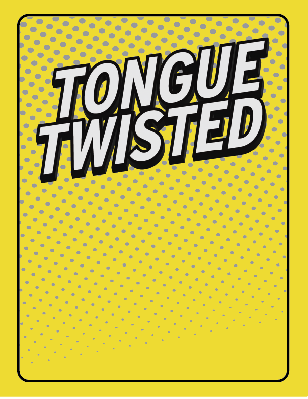
So here’s a cleaned up version (LOGO B) on my take on the logo. To your point earlier, I agree that it doesn’t communicate the gameplay of the game nearly as well as LOGO A, but I think thats okay. My focus was to have something very clean, fun, and strong and I think this does that well.
My take as an artist is that I can try and make both versions of the logo fit and look nice. But to me, they compete with each other a bit, and would serve to confuse. I think we can keep the logo clean, and just let the box design communicate the rest. But its up to you!
LOGO B
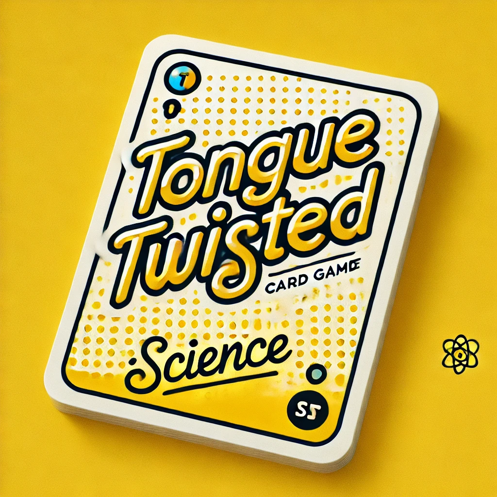
LOGO A
BOX DESIGN
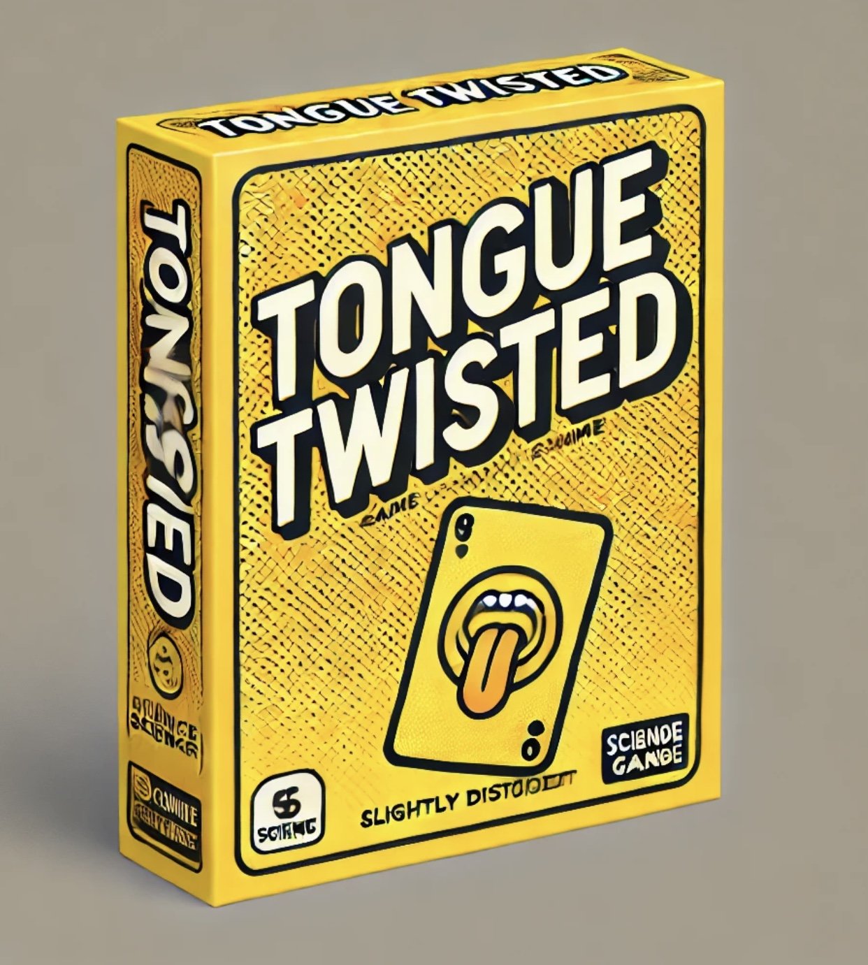
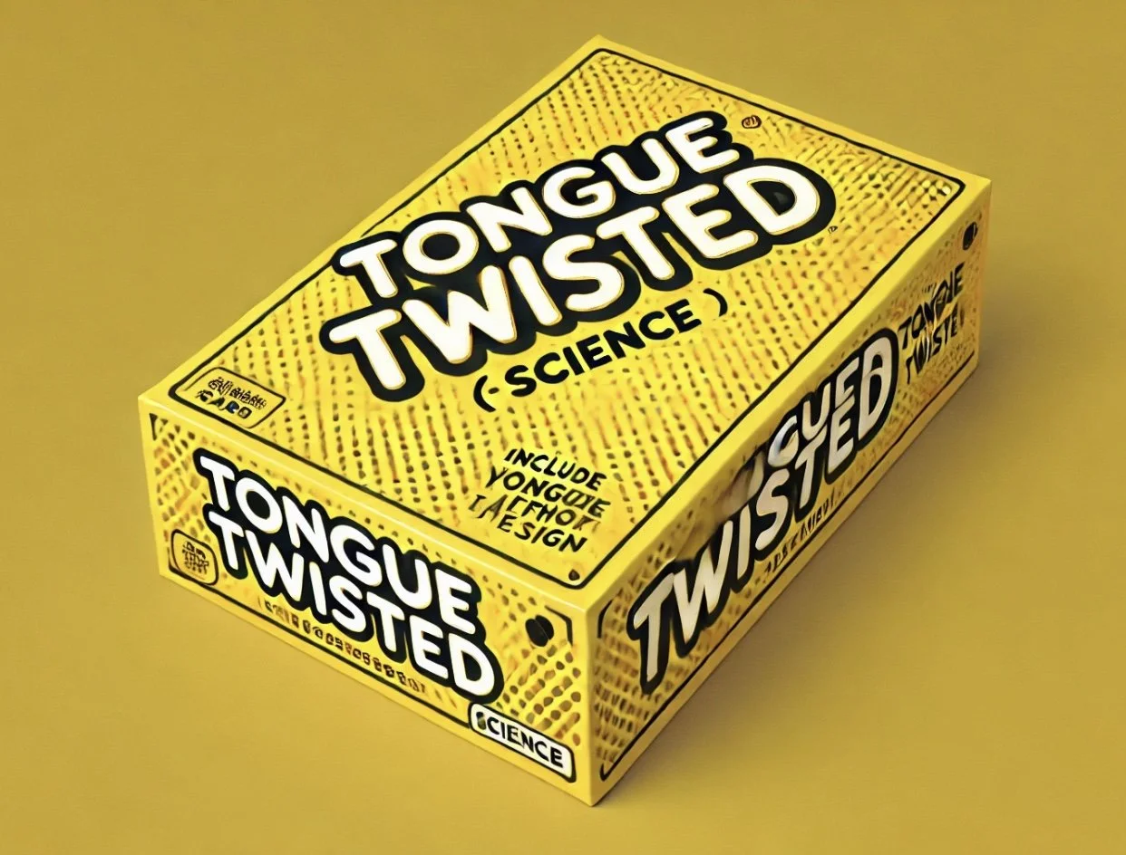
Here’s how the cover is taking shape, based on the box design we have been talking about. (Keep in mind the designs have a safety margin on the sides.) I threw in a holder catchphrase.
I think adding the cards and die adds in a lot of instant context for what the game is. (I had the sand timer on the front at first, too, but thought in looked nicer without.)
CARD DESIGN
Adjusted per your notes. For the blank letter, I thought a box instead of. aline might look nice. Up to you.
What do you think of this direction? Let me know if I’m getting anything wrong, or anything you’re responding to. Looking forward to hearing your thoughts.
Thanks!
Barak
Daniel-
Excited to share the first round of designs for Tongue Twisted! I’ve replicated the logo and overall layout from your comp, and also included some options for the category icons and the central mouth symbol.
MAIN DESIGN
In your last email, you mentioned wanting to incorporate a few extra flourishes—like the handwritten T’s and the S turning into a tongue. I can definitely mock that up in the next round. For now, I wanted to start with a clean version so we can make sure the foundation feels strong before layering in additional elements.
Personally, I like the simplicity of this first pass—it reads clearly even at smaller sizes, and gives you room to build a brand around both the text and the mouth symbol separately. I think having a title treatment plus a standalone icon will give you more flexibility in the long run. I can also explore some alternate font directions in the next phase, depending on your preferences.
CONTRACT
Attaching a simple agreement that outlines the full scope of the project—including the logo, card designs (fronts and backs), box, and style guide—along with the payment structure (50% upfront, 50% on delivery), usage rights, and what happens if either of us needs to pause or cancel. It also includes the Kickstarter stretch goal bonus. Just want to make sure we’re both clear and protected as we move forward. Let me know if you have any questions!
My payment info is Barak Hardley
zelle/paypal/venmo barakhardley@gmail.com
1626 Rockwood St. Apt C
Los Angeles, CA 90026
Looking forward to your thoughts!
Best,


